Redesigning homepage for better clarity
OVERVIEW
Easy Pay Platform is a cutting-edge financial solution for businesses and consumers, offering a powerful mobile app and digital wallet to ensure seamless transactions with restored privacy. Its Admin console streamlines receipt issuance, payment tracking, and secure processing for an exceptional customer experience.
MY ROLE
As the UX/UI Designer, my role was to analyze user behavior, gather feedback, and create a visually appealing and intuitive interface. I collaborated with stakeholders, conducted user research, and crafted wireframes and high-fidelity screens to ensure a seamless user experience that aligns with the brand’s vision.
Background
The redesign of the homepage aims to address the existing usability and visual challenges faced by EasyPay’s website. Through careful analysis of user behavior and feedback, it became evident that the current homepage layout lacked intuitive navigation and failed to effectively communicate the brand’s value proposition. As a result, user engagement and conversion rates were suboptimal. This case study explores the process undertaken by the product design team to revamp the homepage, with the goal of improving user experience, enhancing visual appeal, and ultimately driving better business outcomes.
Research & Discovery
USER INTERVIEW
During the research phase, user interviews and surveys were conducted to gather insights on the Easy Pay homepage. Participants, including current users and industry professionals, highlighted the need for improvements in the visual aesthetics and structure of the page, with focus on specific elements such as demo request buttons, the “what we offer” section, the “why you should trust us” section, and the footer.
Users expressed a desire for a visually appealing homepage with clear and high-quality visuals, cohesive color schemes, and well-structured layouts. They emphasized the importance of easily locating and accessing demo request button, suggesting their placement at the top of the page for better visibility. Users also sought concise and visually engaging presentations of Easy Pay’s offerings, including features, and benefits, with intuitive visuals.
Additionally, they desired a well-organized footer with easy access to important links, maintaining a clean design.
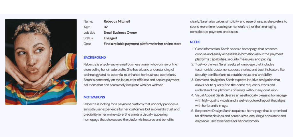
USER PERSONA
Sarah is a tech-savvy small business owner who runs an online store selling handmade crafts. She has a basic understanding of technology and its potential to enhance her business operations.
USER PAIN POINTS
Complexity in Finding Information: Users may struggle to locate relevant information about Easy Pay’s features, pricing, and security measures on the homepage. This lack of clarity can lead to confusion and hinder their decision-making process.
Inefficient Demo Access: Users interested in exploring Easy Pay’s capabilities may encounter difficulty finding and accessing the demo version. If the demo request buttons are not prominently displayed or if the process is convoluted, it can impede users’ ability to experience the platform’s functionality firsthand.
Visual and Aesthetic Issues: Users may find the current homepage visually unappealing or cluttered, affecting their overall impression of Easy Pay. A lack of high-quality visuals, a cohesive color scheme, or a well-structured layout can make the platform appear less professional and credible.
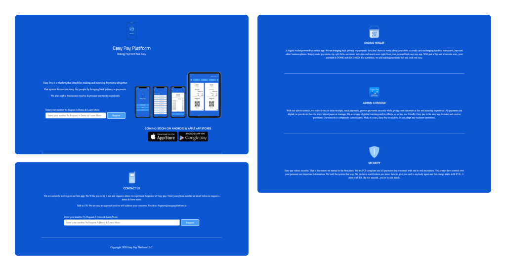
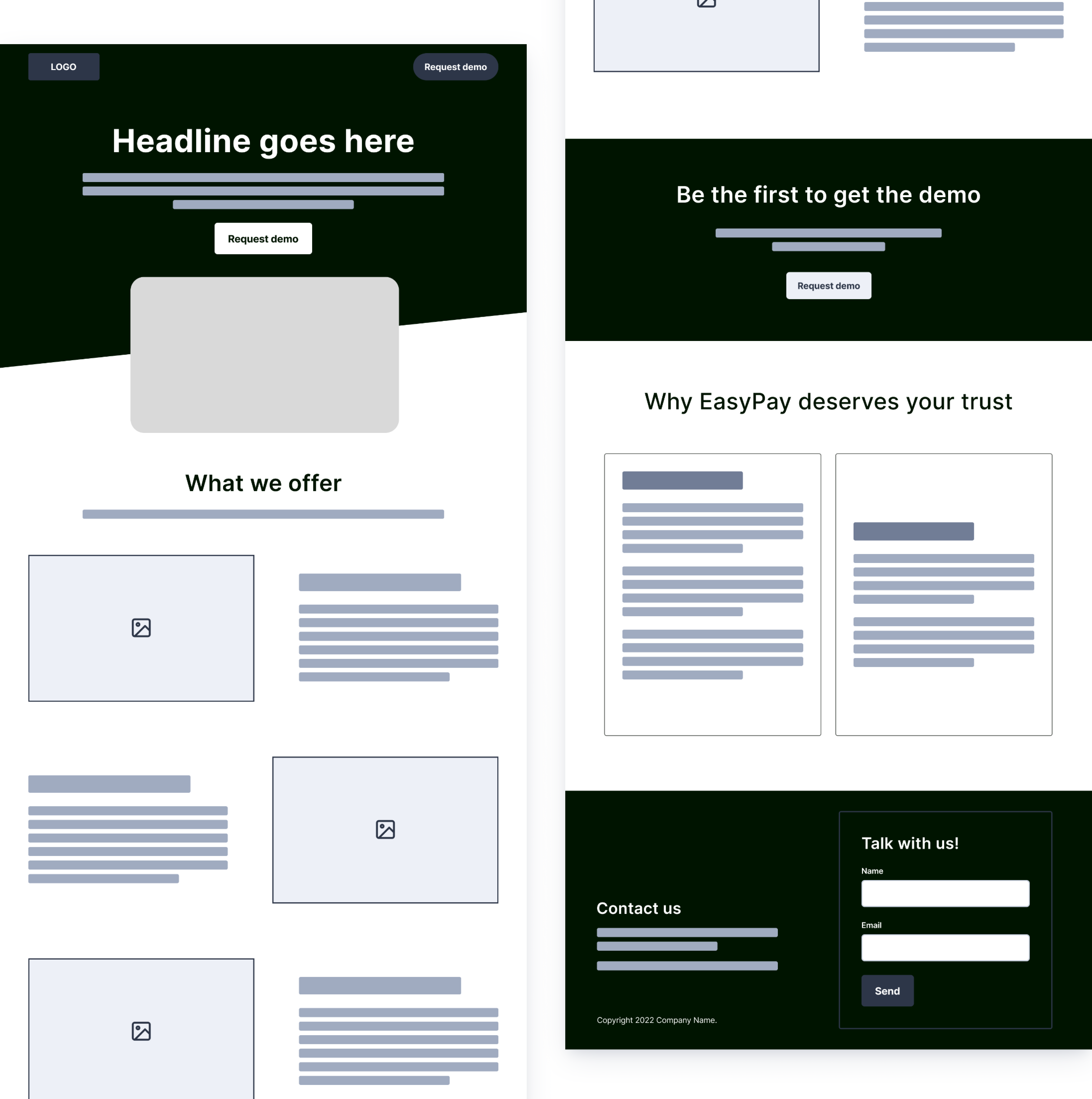
SCREENSHOTS FROM OLD HOMEPAGE
Here are screenshots from the previous design highlighting the hero section, the offerings as well as the footer — which constitute the whole homepage.
SKETCHING AND WIREFRAMING
The process of creating sketches and wireframes for the homepage redesign involved several iterative steps to ensure an effective and user-centered design.
Sketches: Sketching sessions were conducted to generate quick, low-fidelity concepts. This allowed for exploring various layout ideas, content organization, and placement of key elements such as the demo request buttons, “what we offer” section, “why you should trust us” section, and the footer. These sketches served as a starting point for further refinement.
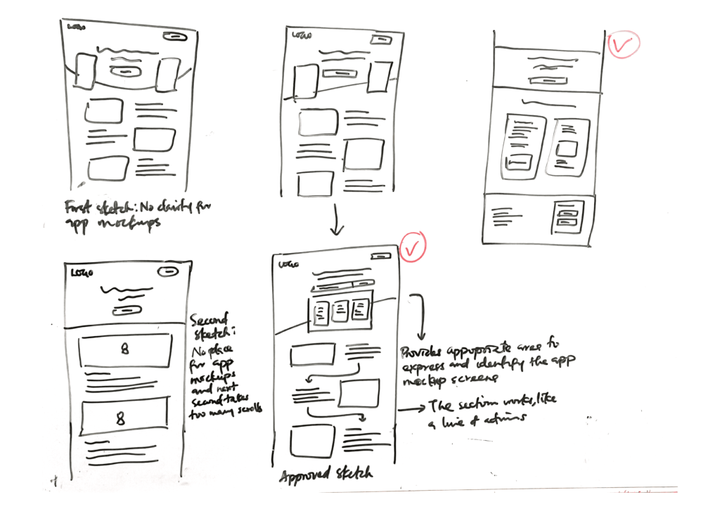
Low-Fidelity Wireframes: Based on the sketches, wireframes were developed. Wireframes provided a more detailed representation of the homepage structure, focusing on content hierarchy, navigation elements, and overall layout.
The wireframes were shared with stakeholders, including the product team, to gather feedback. User testing sessions and usability studies were conducted to validate the effectiveness of the wireframes in meeting user needs and goals. Based on the feedback received, iterations and refinements were made to improve the overall design and user experience.
Design Solutions
Once the wireframes were approved, the visual design phase began. This involved applying the brand’s visual identity, selecting new brand colors, typography, and imagery to create a visually appealing and cohesive homepage design. High-fidelity mockups or prototypes were created to provide a realistic representation of the final design.
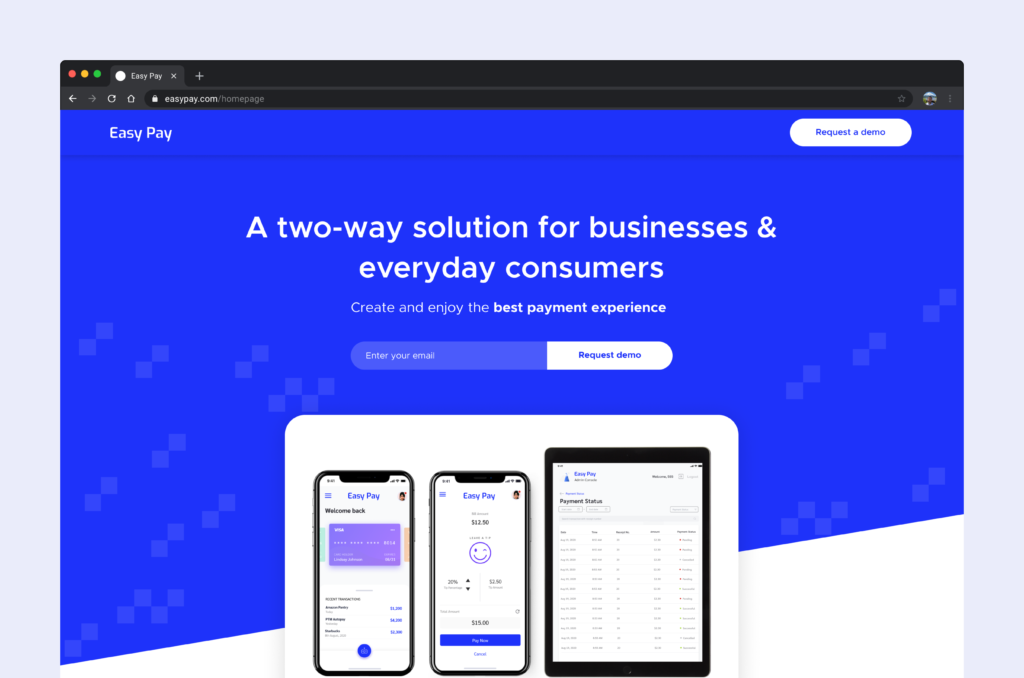
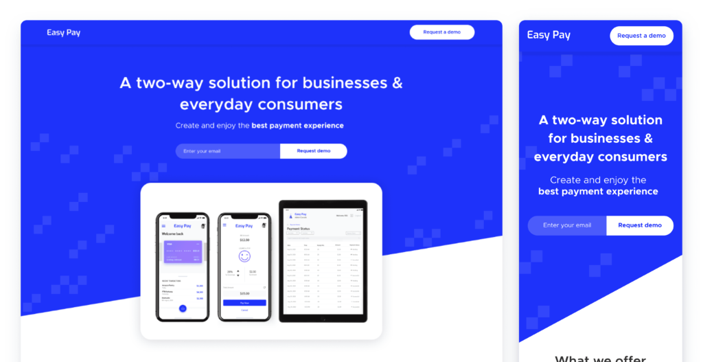
HERO SECTION: INTRODUCING EASY PAY
The previous hero section suffered from poor contrast due to excessive use of the brand’s primary color, creating accessibility challenges. Additionally, a two-column layout with center-aligned text led to an imbalance in the section’s presence. However, the new design addresses these issues by improving text hierarchy, introducing a new approach to coloring the form, and incorporating a clear hero copy followed by a field area for users to input their email and request a demo. The layout imbalance was resolved by adopting a single-column view, and the navigation bar was redesigned to align with contemporary styling.
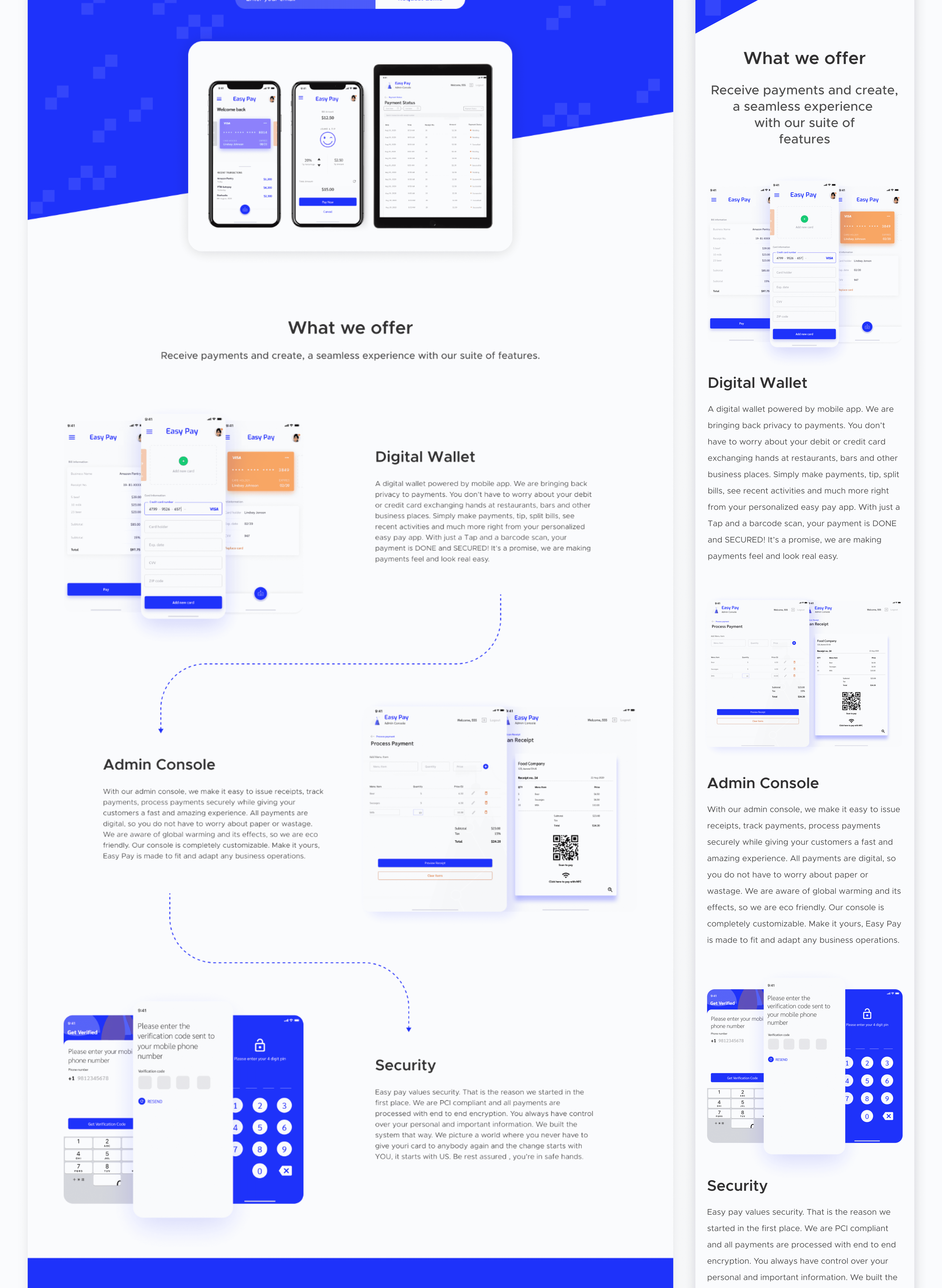
DESCRIBING "WHAT WE OFFER"
The previous ‘what we offer’ section suffered from excessive use of the primary brand color and outdated, poorly colored icons. In the new section, we addressed these issues by implementing clear calls-to-action (CTAs) and a visually appealing two-column view for design artifacts. Trust was enhanced by incorporating realistic product screens as imagery, aimed at driving customer conversion. To modernize the website’s appearance and optimize contrast, we utilized a white background for the new UI. These improvements create a more visually engaging and user-friendly hero section, elevating the overall user experience.
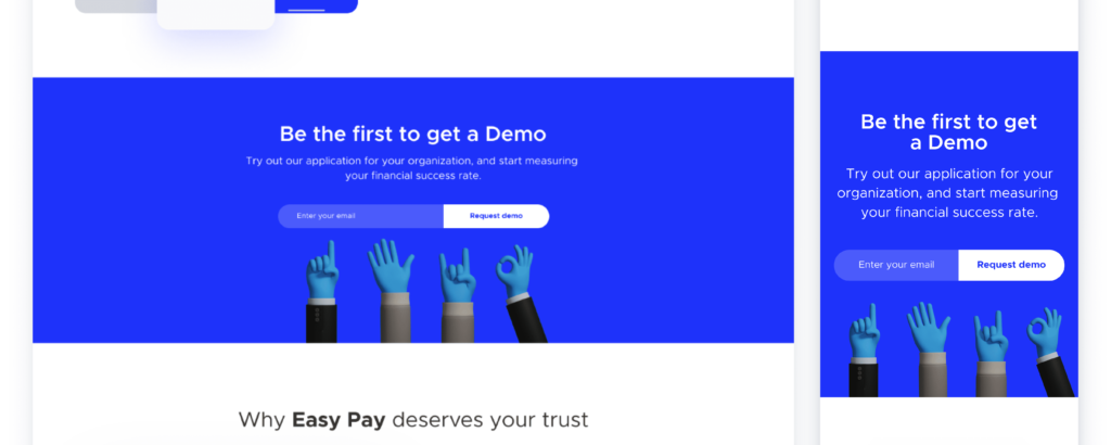
"REQUEST A DEMO" SECTION
The newly introduced demo section serves as an intermediary experience within the scrolling flow, strategically aimed at driving lead generation. This section fills the gap that was absent in the previous design, offering users an opportunity to engage and experience Easy Pay’s offerings firsthand.
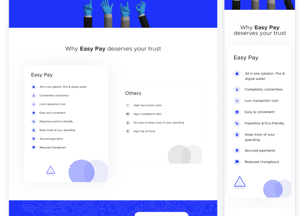
BUILDING TRUST AND SECURITY
The “Why Easy Pay deserves your trust” section highlights the app’s benefits and distinguishes it from competitors. It emphasizes Easy Pay’s robust security measures, seamless user experience, and innovative features that set it apart, fostering trust and confidence in the platform.
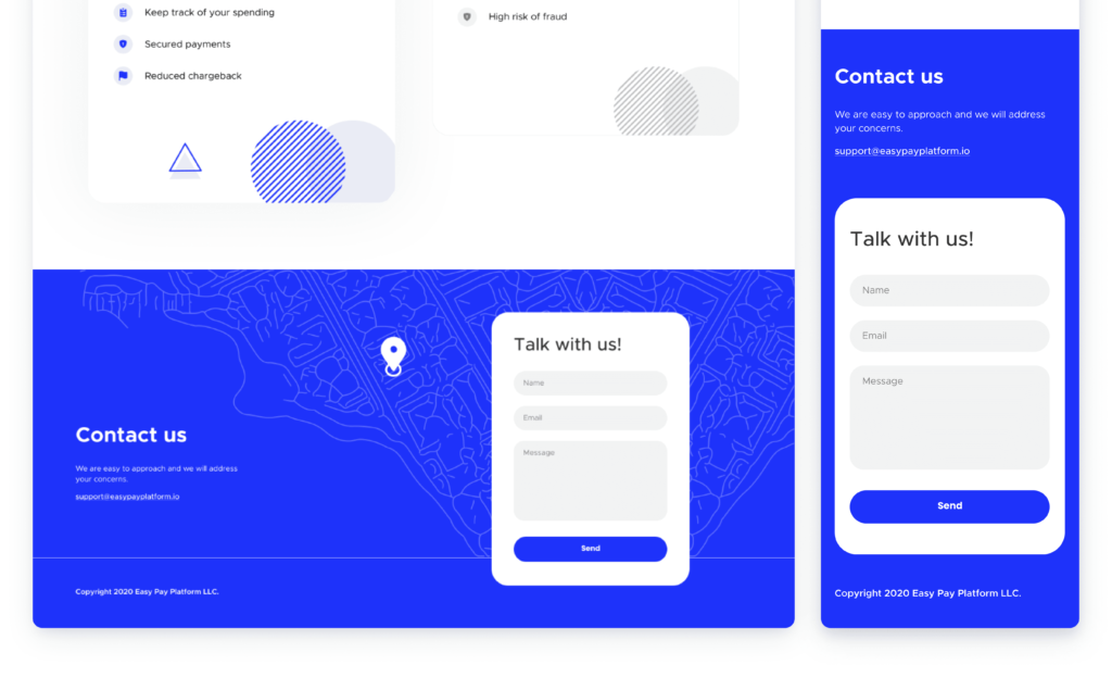
CONNECTING THROUGH THE FOOTER
The old footer presented challenges in aesthetics and user experience, which were addressed in previous sections. The redesigned footer focuses on improving communication by introducing a contact form that is easily discoverable, eliminating the need for users to navigate to a separate page.
Impacts
Two months after the launch of the homepage redesign, the following impacts were recorded:
Increased User Engagement: After the redesign, the average time spent on the homepage increased by 22%, indicating improved user engagement and interest in the content and offerings.
Higher Conversion Rates: The redesigned homepage led to a 18% increase in conversion rates, with more visitors taking desired actions such as signing up for demos, requesting more information, or making purchases.
Improved User Satisfaction: User feedback surveys conducted after the redesign showed a significant increase in user satisfaction ratings. Users appreciated the enhanced visual aesthetics, improved navigation, and clearer presentation of information.
Reduced Bounce Rates: The bounce rate on the homepage decreased by 9%, indicating that users found the redesigned page more engaging and compelling, encouraging them to explore further instead of leaving immediately.
Increased Demo Requests: The prominent placement and improved visibility of the demo request buttons resulted in a 37% increase in the number of users requesting demos. This indicates that users found it easier to access and engage with the demo version of Easy Pay.
Key Learnings
Clear and Accessible Information
The importance of presenting information in a clear, concise, and easily accessible manner was reinforced during the redesign process. Users responded positively to the redesigned homepage when information about Easy Pay’s features and security measures was presented in a clearer, straightforward and transparent manner. This emphasizes the need to prioritize information hierarchy and ensure that key details are readily available to users, ultimately improving their understanding and decision-making process.