Socialroots is a worker-owned software cooperative that aims to revolutionize collaboration by creating a data commons. Their innovative app enables individuals and groups to seamlessly network, collaborate, and communicate effectively. By integrating action commitments and updates within the natural flow of conversations, Socialroots empowers users to stay engaged and committed to their objectives.
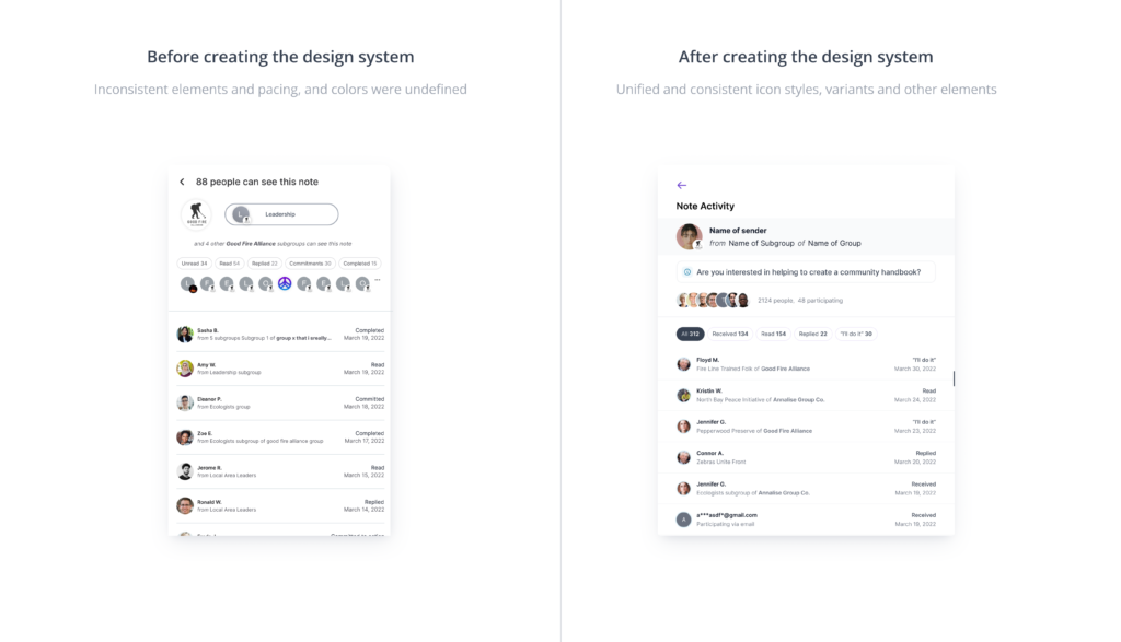
As the beta version of the Socialroots app approached its launch, the need for a comprehensive design system became evident. This case study explores the process of developing a design system for Socialroots, a worker-owned software cooperative. The design system aimed to provide a consistent, shared experience, unify visual solutions, and improve collaboration among teams, particularly designers and developers. Leveraging the power of Figma as a collaborative tool, the design system encompassed guidelines, reusable UI components, and templates to enhance the Socialroots web application. This study highlights the evolution from ad hoc decision-making to a structured approach, enabling scalability, design integrity, and enhanced productivity within the Socialroots ecosystem.
As the lead designer, I spearheaded the creation of the design system for Socialroots. I guided the conceptualization and development process, ensuring cohesion, scalability, and a consistent user experience across the company’s expanding ecosystem.
Akinkunmi Oyehan, UX Designer. Naomi Sherry, Product Manager.
Creating a successful design system for Socialroots required thorough research and planning, inspired by industry-leading brands like Spotify. The aim was to turn the vision into a reality by mapping out all components, from the simplest to the most complex, while establishing optimal design and implementation guidelines.
Recognizing the importance of unifying the user experience (UX) and user interface (UI) across platforms, our team emphasized the need for a design system that could be easily maintained and implemented on both the design and development sides. We needed a design system that could function across various devices without the need for splitting significantly based on devices. To address this challenge, extensive research was conducted to identify the benefits and best practices of unifying UX/UI across devices. The team examined case studies, analyzed industry trends, and explored successful examples from various companies. Drawing inspiration from these findings, we formulated a compelling argument for the advantages of a unified approach, highlighting enhanced brand consistency, improved user experience, and increased efficiency in design and development processes.
Furthermore, we conducted internal surveys and interviews to gather insights from the Socialroots stakeholders and team members. This helped us understand their concerns, preferences, and expectations regarding the design system. We encouraged open discussions and collaborative decision-making to ensure that everyone’s voices were heard, fostering a sense of ownership and buy-in from the team.
The research and planning phase laid the foundation for the design system, setting the stage for a cohesive and scalable solution. By drawing inspiration from industry leaders, addressing concerns about split designs, and involving the team in the decision-making process, we established a strong case for the unification of UX/UI across platforms within the Socialroots design system.
To meet the demands of the constantly evolving app, our design system needed to prioritize flexibility and adaptability. Working closely with the lead developer, we established a generic structure as the foundation of our system. This involved breaking down all elements into their fundamental components, ensuring a modular approach. Crucially, we detached the most common elements, such as typography styles, colors, inputs, and buttons, from any specific context. This approach allowed for easy integration of future changes, ensuring a seamless evolution of the app while maintaining design consistency.
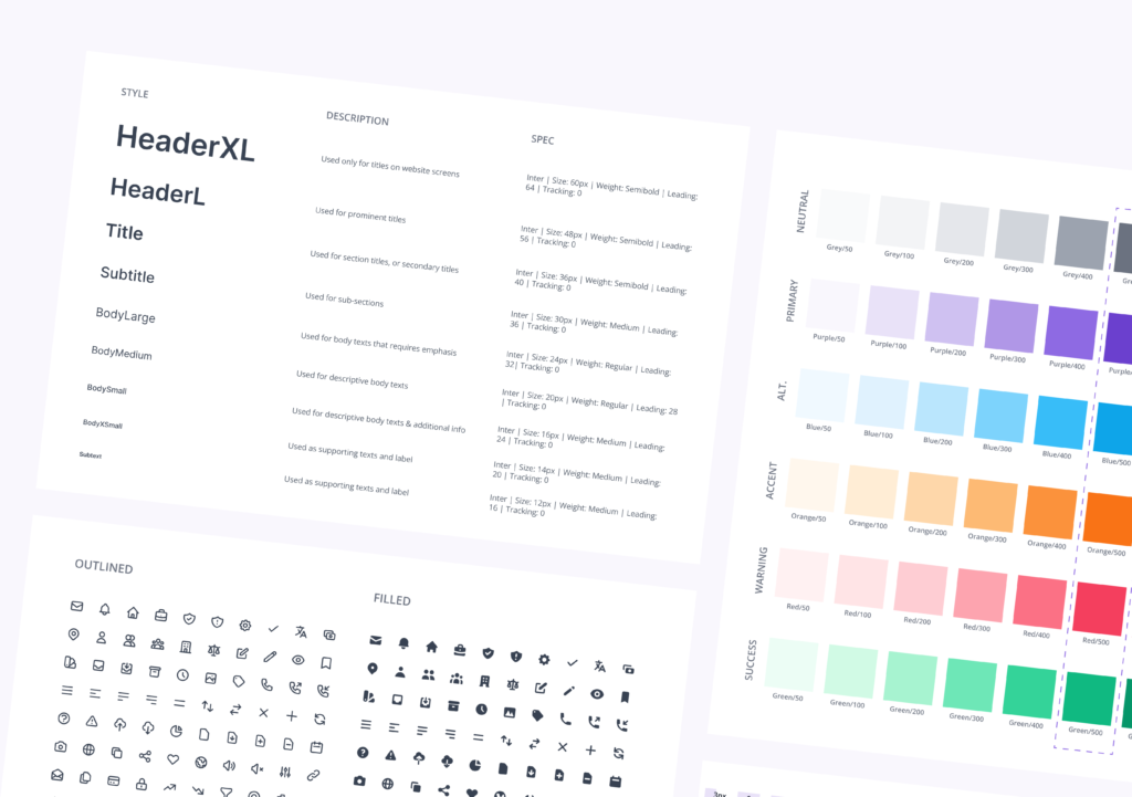
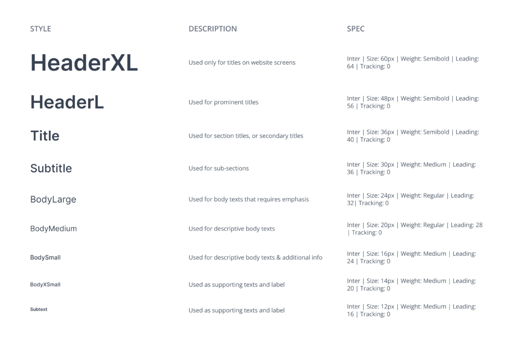
We defined our typography styles with generic names instead of specific ones. The type scale contains fourteen (12) font sizes and each expressed in 10 styles each ranging from “extra thin” to “black” of the popular font: Inter. This further allows for easy access to typographical dynamics required of a complex web application, such as Socialroots.
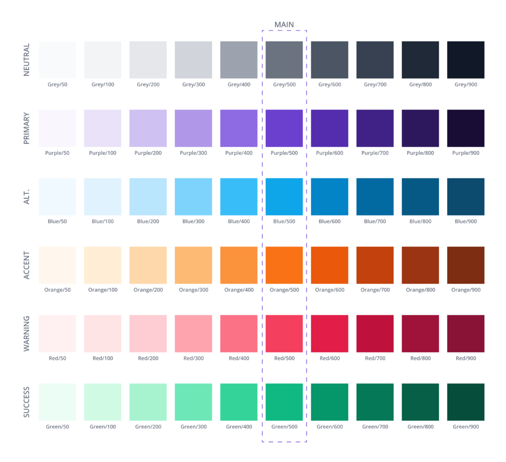
The color palette was deconstructed into system colors across multiple tints, providing both flexibility and scalability for future expansion. By centralizing color changes in one location, the ability to instantly update the main color throughout all components was achieved. In addition to system colors, user-selected colors are automatically generated with corresponding tints, ensuring true customization while adhering to the design system’s principles.
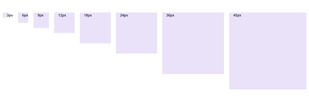
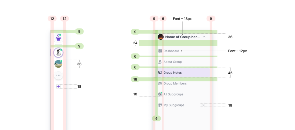
A well-designed spacing system is a vital element in creating visual harmony and maintaining consistency within a user interface. By defining precise measurements and guidelines for spacing between elements, such as margins and padding, the spacing system ensures optimal readability, balanced compositions, and a pleasing visual experience.
The spatial values of this system are determined in the factor of 3 with 6 being the base; hence 3, 6, 9, 12, 18, 24, 36, and 45.
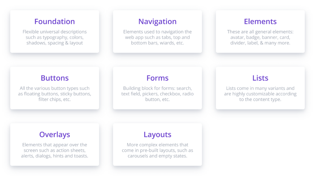
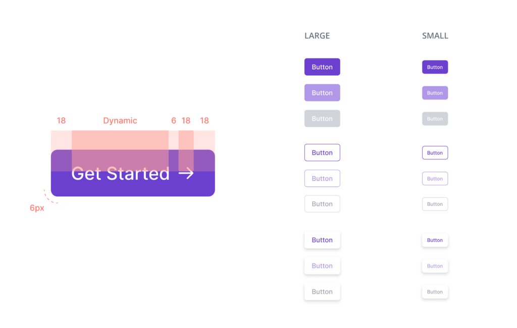
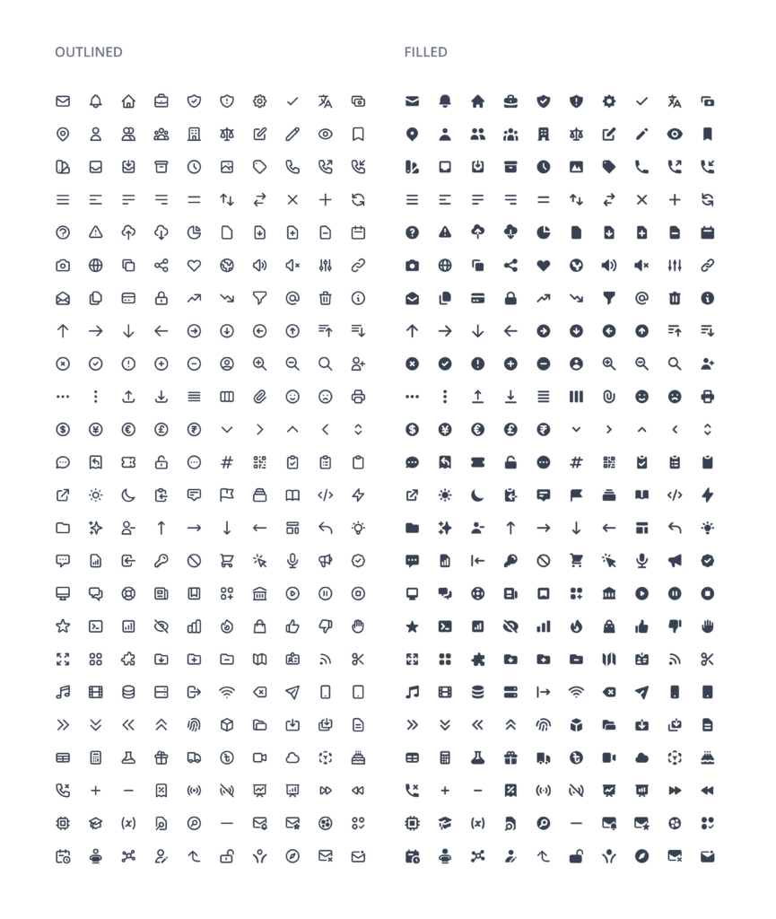
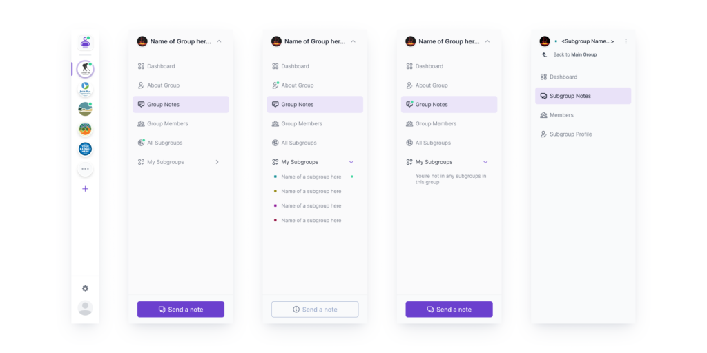
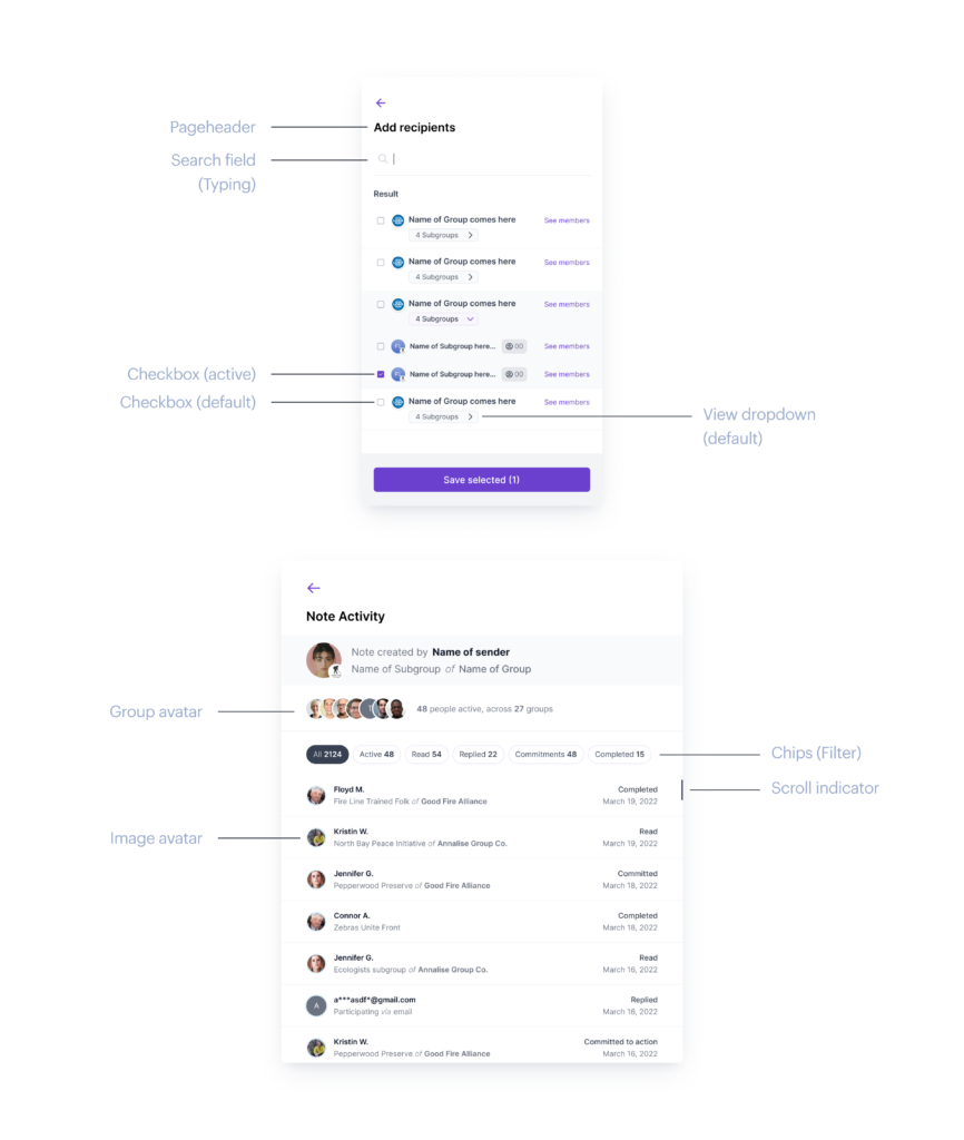
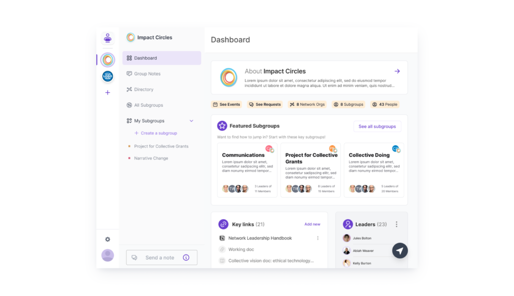
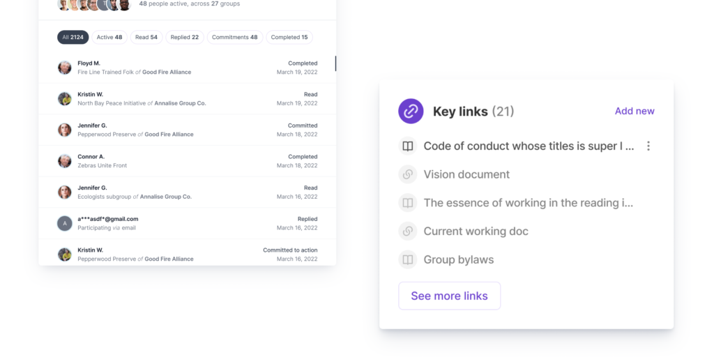
Having established a foundational system for colors, typography, and spacing, we proceeded to focus on fundamental elements like buttons, iconography, and so on. These served as the essential building blocks for constructing more intricate components and flows.
The defined set of basic rules facilitated the creation of new components, as we could leverage the previously established guidelines. Each added component adhered to specific guidelines, specifications, and behavior, based on the components it was derived from. This streamlined approach ensured consistency and efficiency throughout the design process.
There are 480 basic variants of the icons recreated for use. 240 icons are filled icons, while the remaining 240 icons are the solid equivalent of the filled ones. These icons comprise general icons that are commonly used such as message, notifications; and some are special icons that are based on features of the web applications, such as the “send and notify”, “Message now”, “No messages” icons.