
This case study focuses on the redesign of the wholesale cart and checkout experience for Gabriel&Co Partners, a US-based B2B e-commerce website. The goal is to improve the efficiency, user experience, and overall performance of the wholesale purchasing process.
By addressing pain points and implementing strategic design changes, the aim is to improve the wholesale cart checkout as well as streamline processes, enhance user satisfaction, and ultimately drive increased conversions.
As the lead product designer, I was responsible for conducting research, creating visual and experience design and directions, as well as the content strategy.
The existing wholesale cart and checkout experience faced several challenges that hindered user satisfaction and conversion rates. These challenges included:
These issues were negatively impacting the user experience, resulting in 45% of cart abandonment and substantial decrease in sales.
The primary objectives of the redesign were to simplify and optimize the wholesale cart and checkout process. Key goals included reducing the number of steps required to complete a purchase, enhancing usability and clarity of information, improving visual design to align with the brand identity, and integrating best practices for ecommerce conversion optimization. The aim was to create an intuitive and efficient wholesale purchasing journey that would encourage users to complete their transactions.
After three (3) meetings through Microsoft Team with the business stakeholders, we were able to get feedback on what the users think about the previous wholesale cart and checkout system, and we shared a few ideas on how to make it better. After conducting the interviews, I was able to identify the following solutions for the wholesale cart and checkout redesign:
Wholesale Cart
Checkout
On a general note
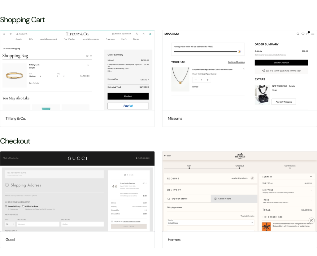
Research of the cart and checkout of some of the world’s largest Jewelry and fashion brands’ (i.e. competitors’) websites helped me to reach a few more conclusions:
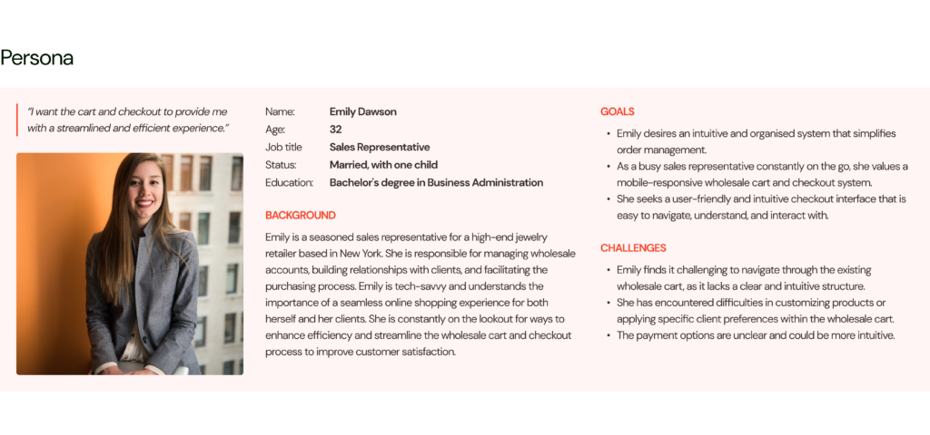
The persona, Emily Dawson, is a seasoned sales representative for a high-end jewelry retailer based in New York.
Feedback from users (15 retailers and sales ambassadors) was largely generic: hard to find some of the actions because of similarity in button colors, UI doesn’t look modern…. There wasn’t so much we could get from the users as they had worked with the website quite often, day by day and had become accustomed to the current flow and look.
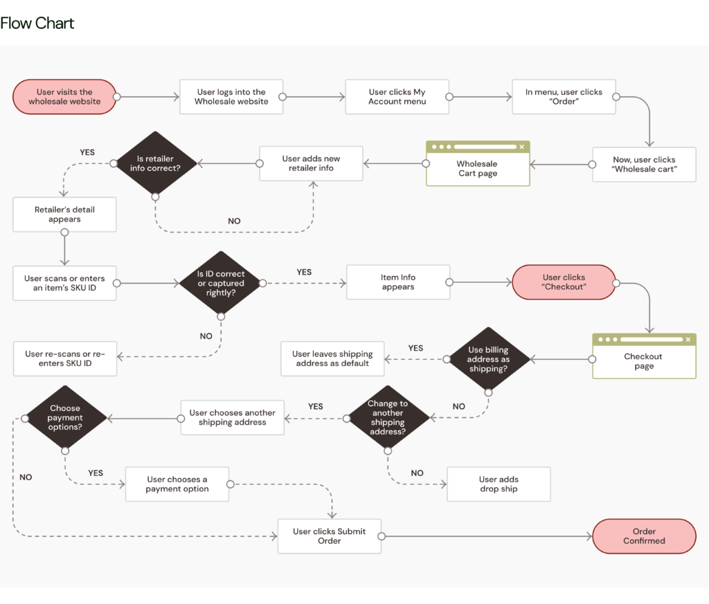
In order to be able to identify possible gaps in the UX of the current wholesale cart and checkout process, I drew a flow chart from the account menu where you access the wholesale cart to the checkout.
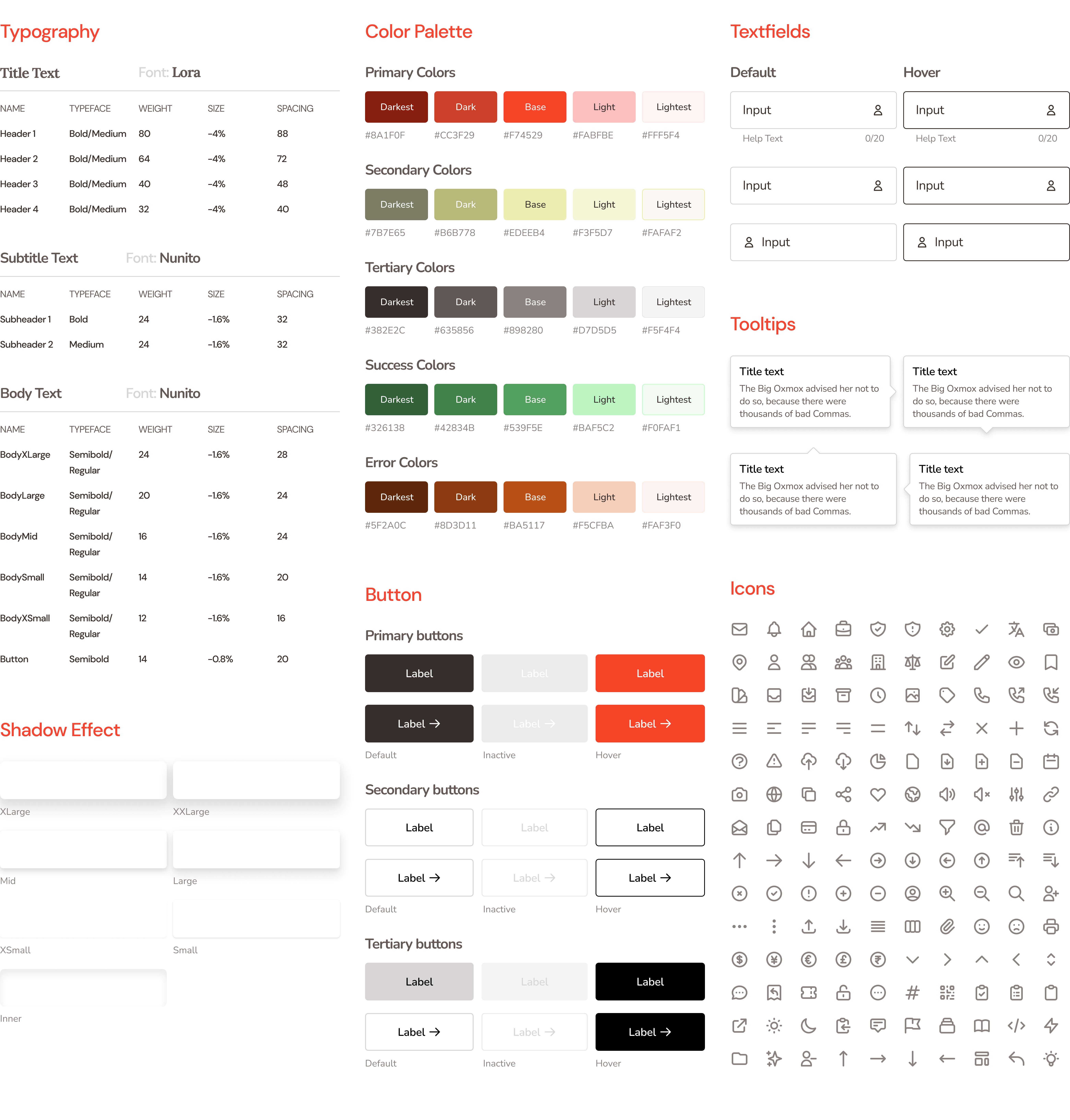
In order to reflect the corporate style and ensure brand consistency, I designed a design guideline that continued to be improved and increased as the design work went on. These include components such as typography, color palette, button, Input fields, colors, icons, tooltips, cards, avatar, and so on.
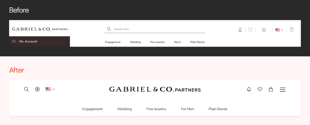
With a new design guideline and patterns, the header was redesigned to be simpler and more intuitive. The header hence was restructured with the logo centered, realignment of the icons and the top-selling products and collections.
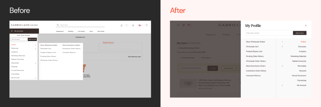
And above is the modal dialog when the menu icon on the header is clicked — cleaner and inspired by the new modal dialog approach.
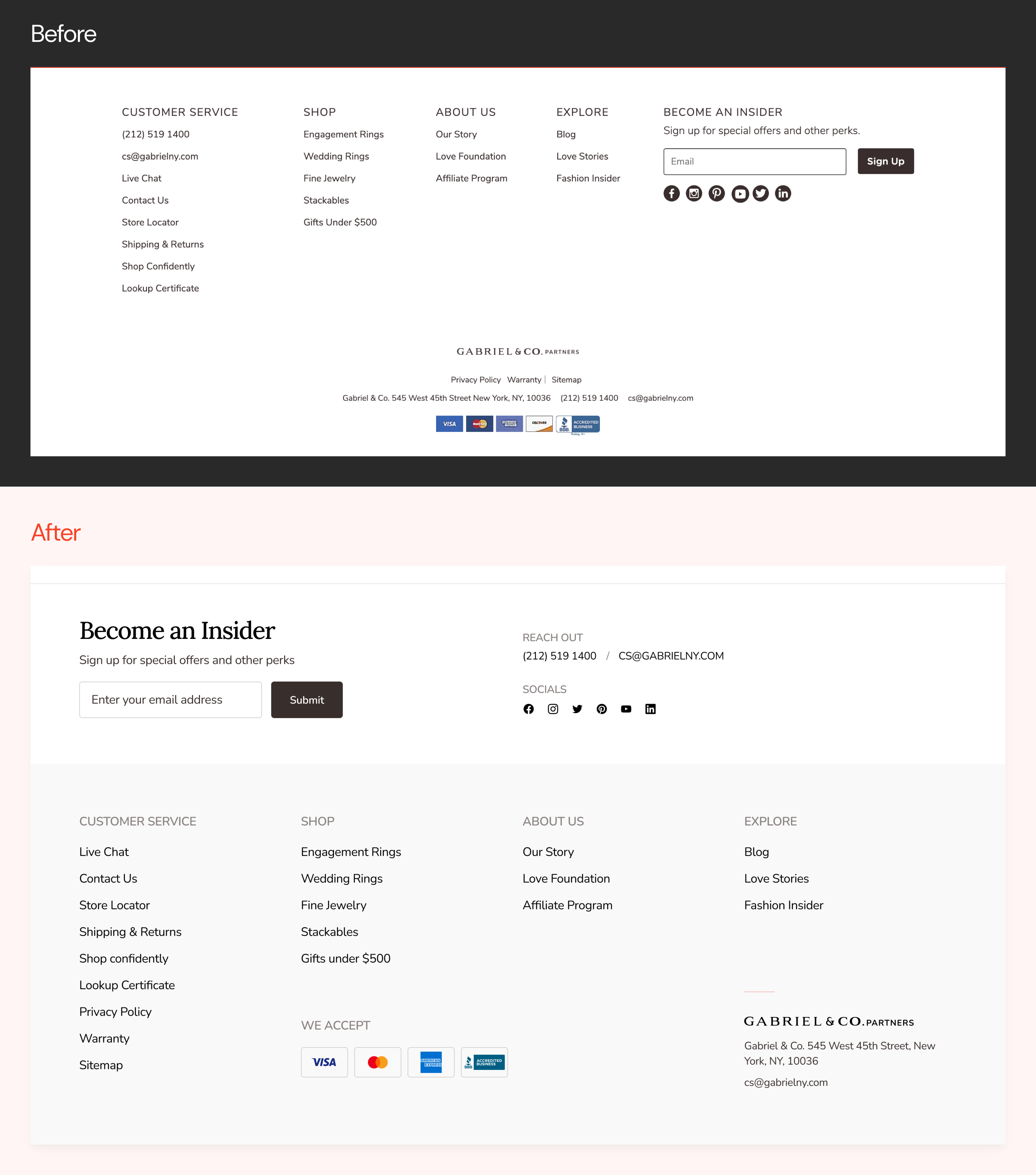
As the footer is considered as a roadmap to some core areas of the website, Gabriel&Co Partner’s footer is being optimized by making the navigation clearer, highlighting contact information, support, socials and so on, to enhance accessibility and usability.
The wholesale cart would be highlighted in three phases: empty state — which has three scenarios; pages when items are being added, and modal dialogs.
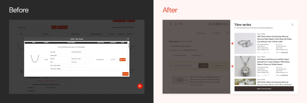
Here (above) is the comparison of the old empty state screen and the new design.
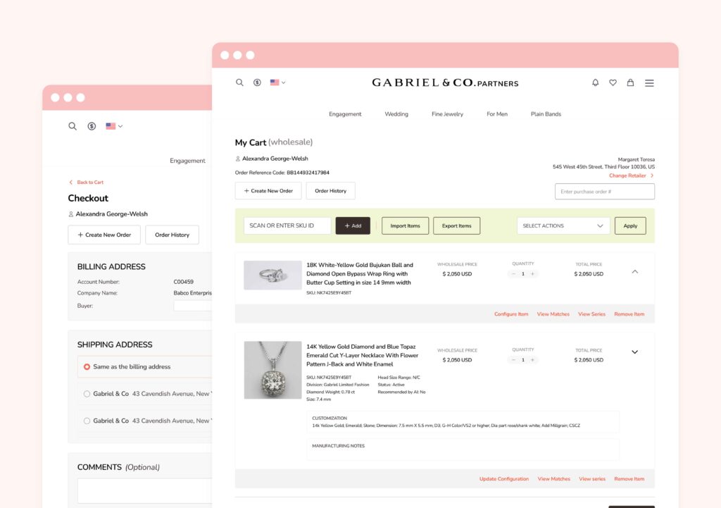
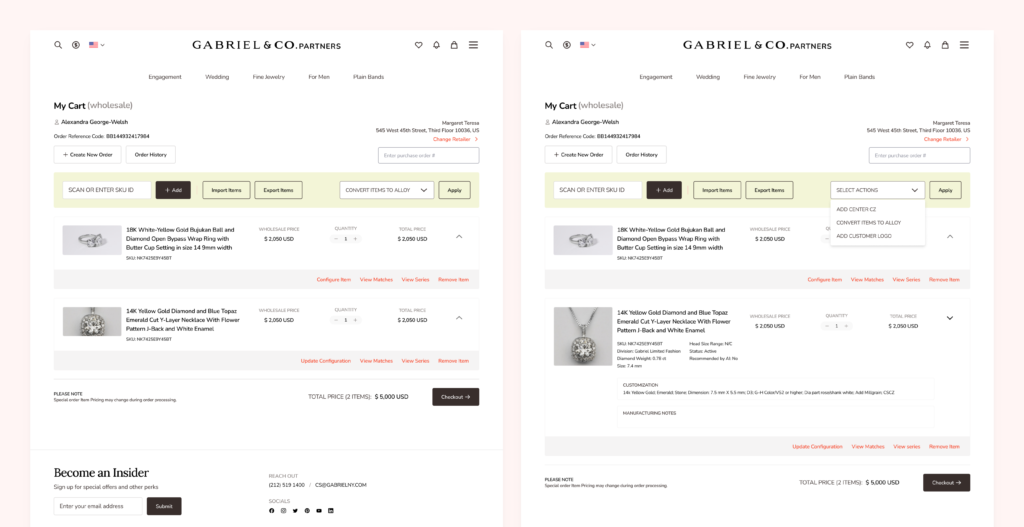
Here, the user has added the items where they can add more items, and select bulk actions. More so, each item appears in a container that is collapsed by default (which saves space) and can be expanded to see more details about the item. In addition to that, users are able to perform actions on the item such as configure item, view series, view matches and remove item.
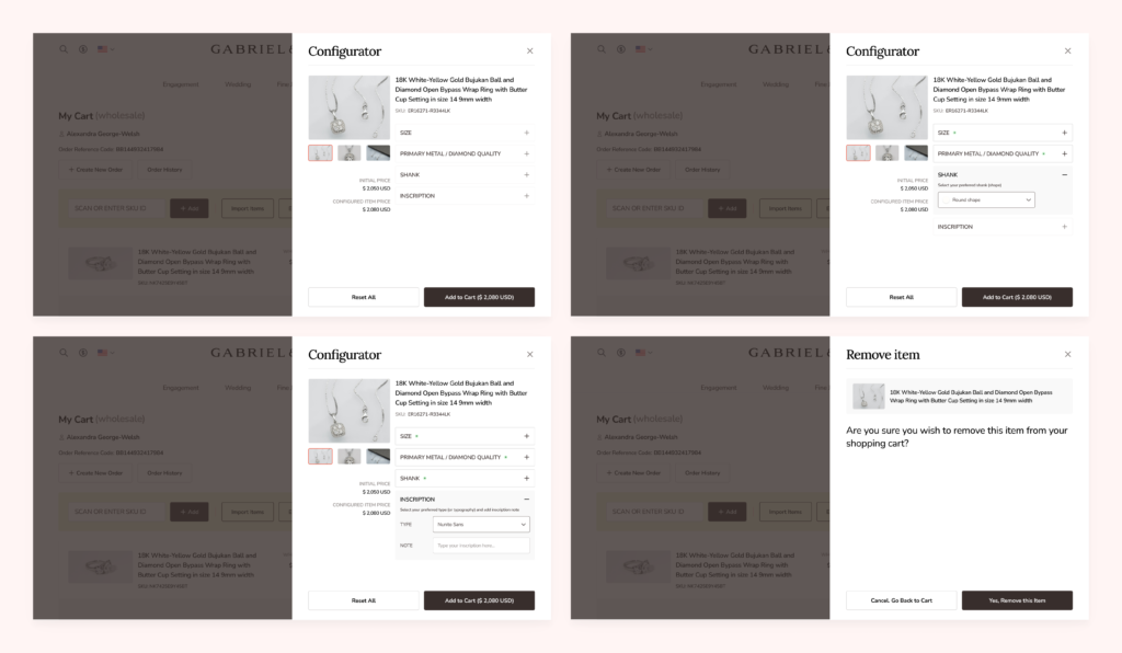
Actions such as view series, view matches, configure item or upgrade configuration, and remove items are presented in modal dialogs that slide from the right side of the screen (usually from the area where the linked button is aligned to on the side of the item container).
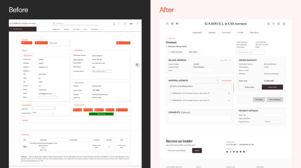
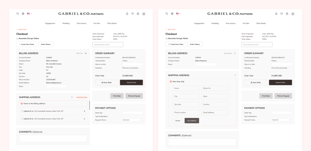
The checkout redesign is an attempt to help the user understand the importance of each section on the page. First, a back function was added to afford users to be able to easily go back to the wholesale cart. Also, the billing address section only shows lesser information at default (which can be expanded to see other information). The user also gets to see the order summary as soon as the page opens where they can easily access the “submit order” button.
In the shipping address, users can use the default address which is the billing address, or select an already saved address or add a new temporary address as “new drop ship”.
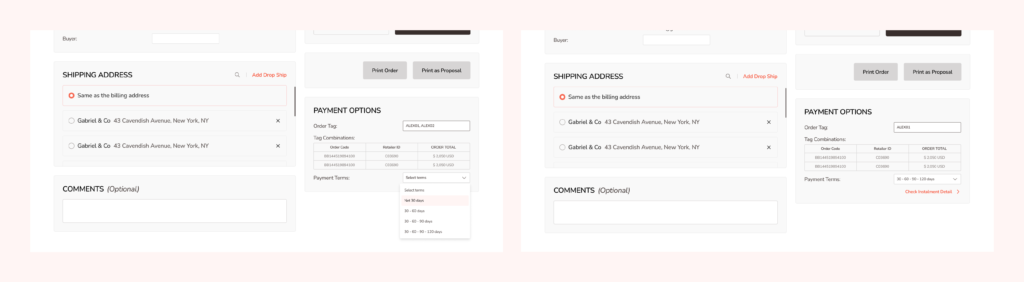
The checkout Payment option in the new design corrects some difficulties in the old design by allowing users access their order tag, tag combinations and payment terms more clearly.
In the old design, the installment detail appears as a new section after the user has selected a payment term — which makes the page look more complex and clumsy. In order to solve that, the installment detail now appears as a modal dialog where users can read the details of the payment and also either auto-calculate their payment which splits the payment equally across payment breaks or users manually input the percentage of cost to be paid at each break that would be totaled to 100%.
Usability Testing
We conducted usability testing sessions with real users of the product who are sales representatives of businesses that have been using the product. During sessions, we have set out specific actions to understand the user experience during each scenario. These sessions were held via Microsoft teams.
Scenarios to test for are:
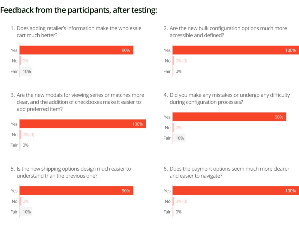
This feedback results to the following submissions:
The checkout is on the development stage at the moment. My further steps are:
Throughout the course of this work, I have gained valuable knowledge due to the need for a fast and adaptable approach. Given the company’s operational style, we had to approach the project with a high level of flexibility. This approach enabled us to swiftly identify and address issues as they arose. Consequently, we were able to deduce the problems by analyzing user behavior, focusing on the most common actions within the app, and taking into account user complaints received over the past few months.
Ultimately, we diligently worked on and thoroughly tested the screens at each stage, resulting in improved visual iterations and significantly reducing the time required. Additionally, due to the effectiveness of the old screens and time constraints, we made the decision to forgo wireframing and directly transitioned to high-fidelity designs.
As designers, we constantly make design decisions down to the smallest pixel. However, as we move forward, we often lose sight of the decisions that led us to where we are. This is where documentation plays a crucial role. Not only does it assist in keeping track of our design journey, but it also enables effective communication of our design.